TravelPerk
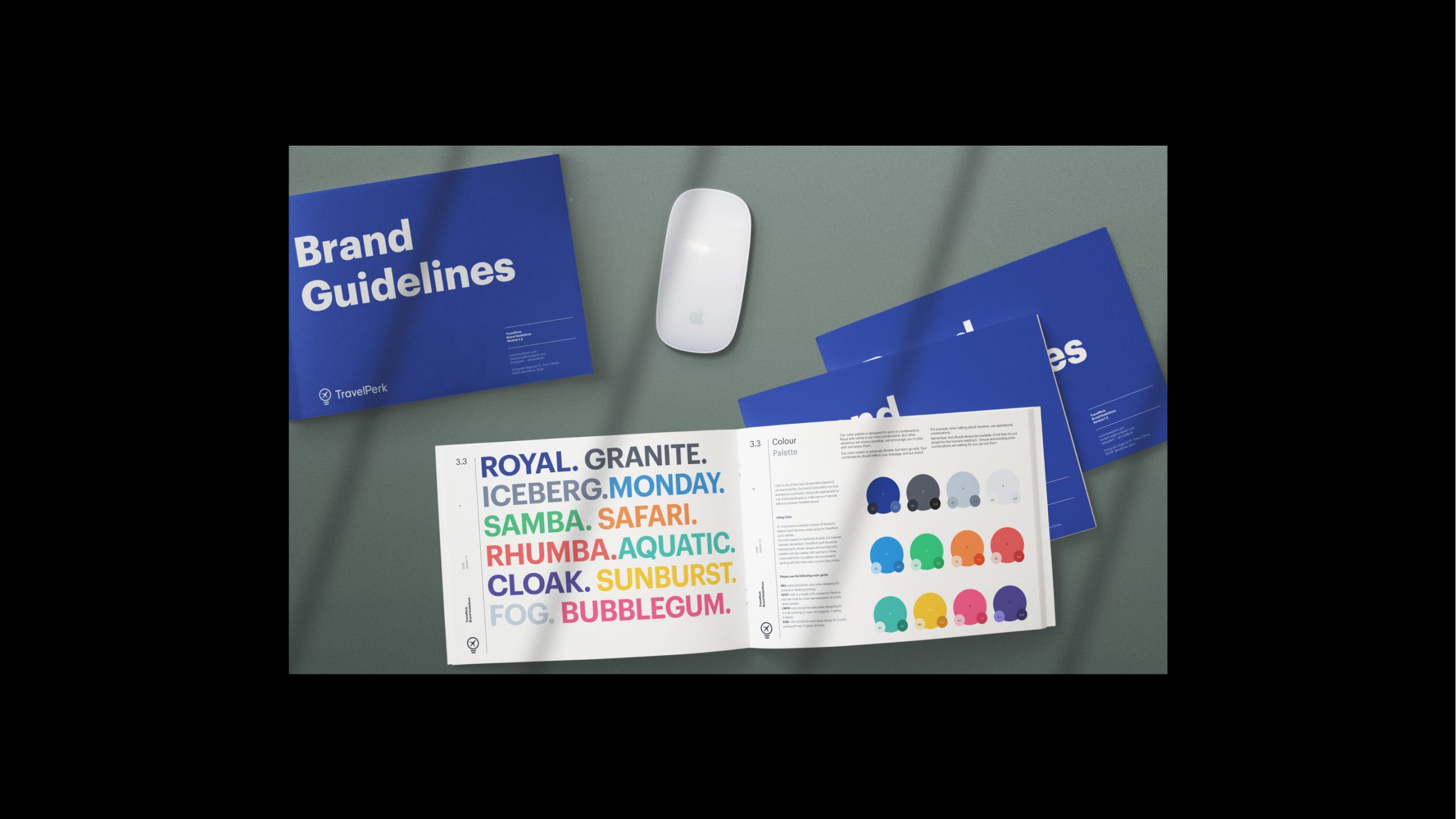
Branding
Concept
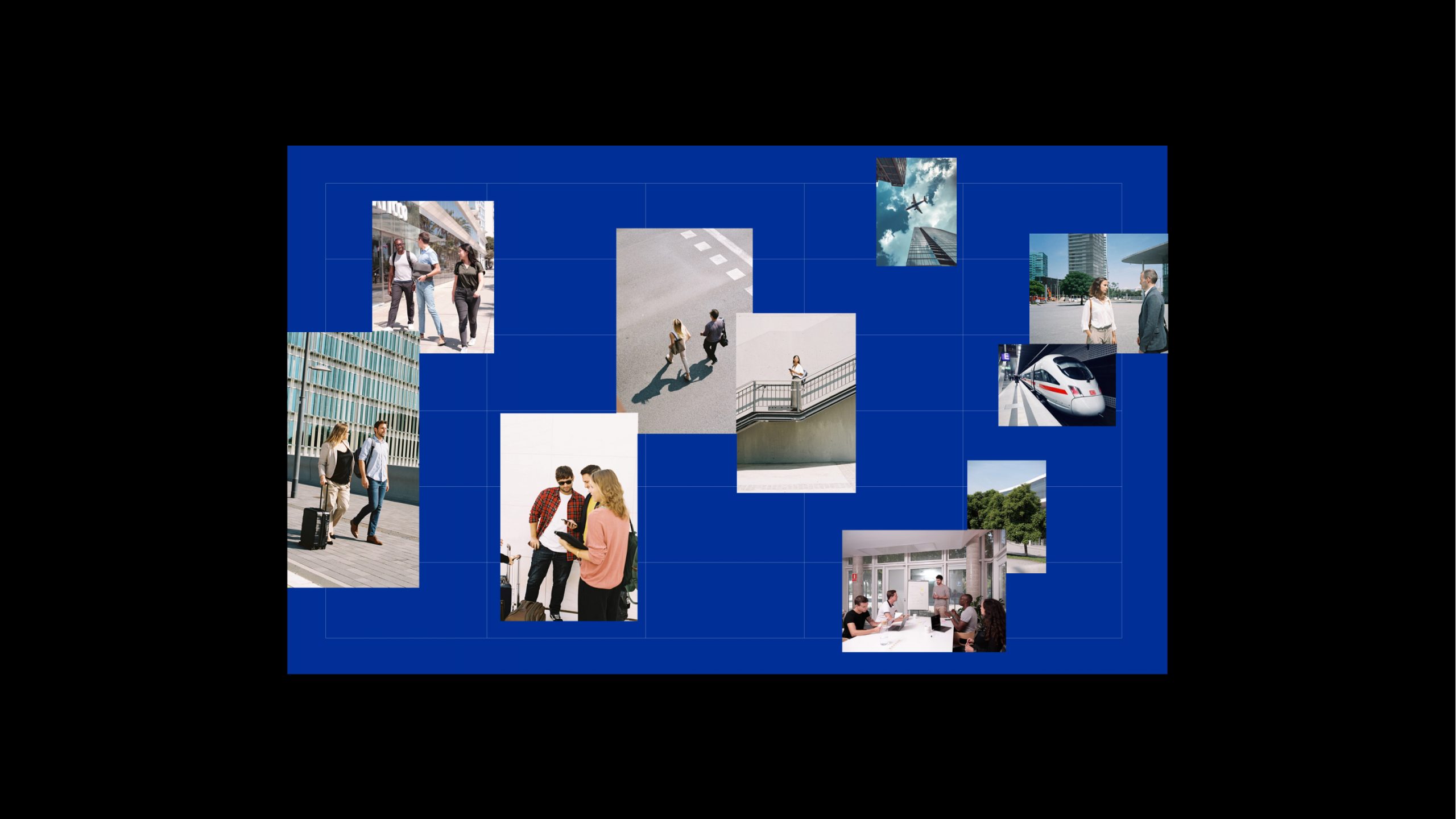
Art Direction
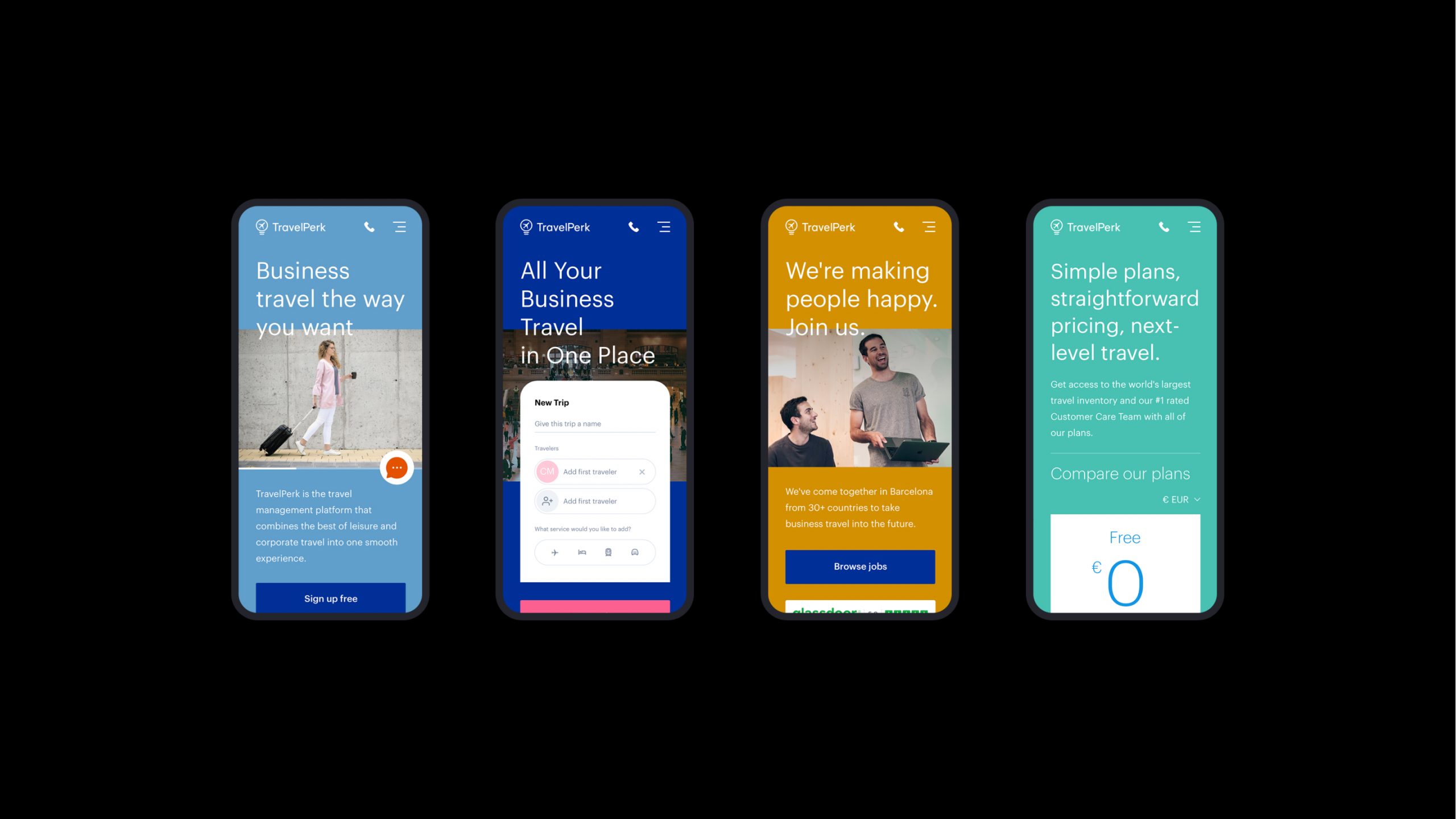
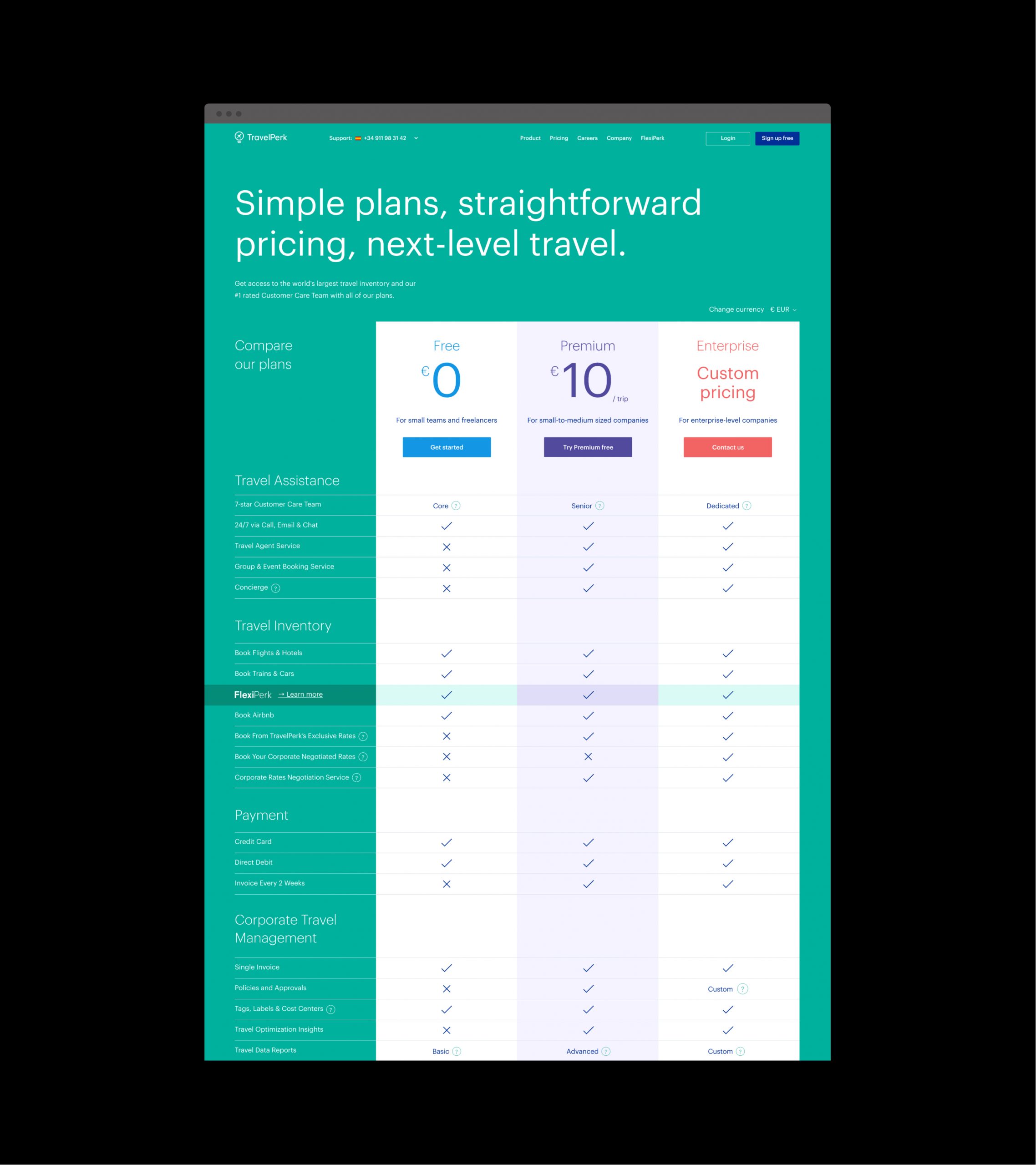
UI/UX
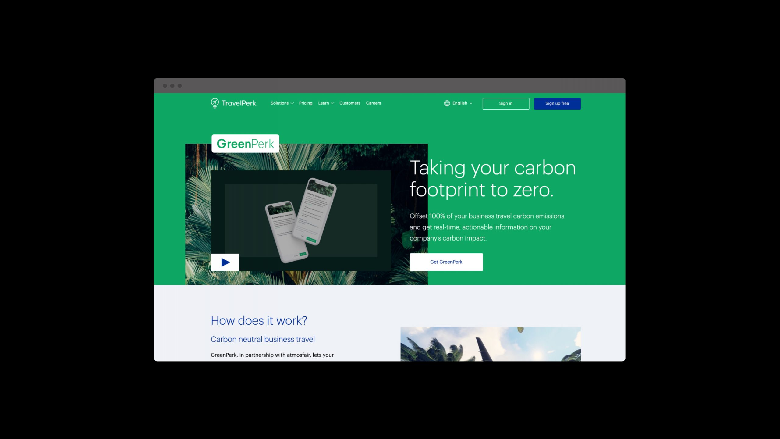
Walking towards a modern and sustainable business travel model.
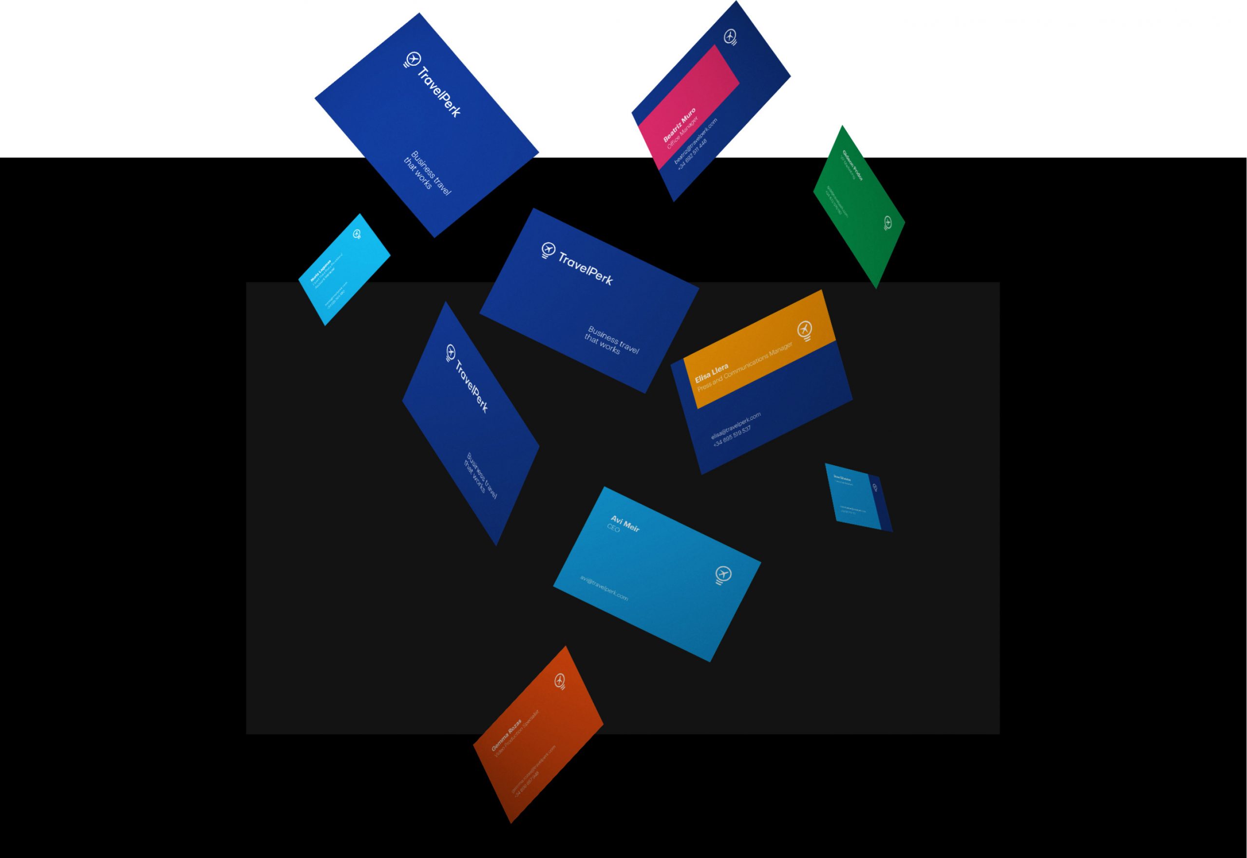
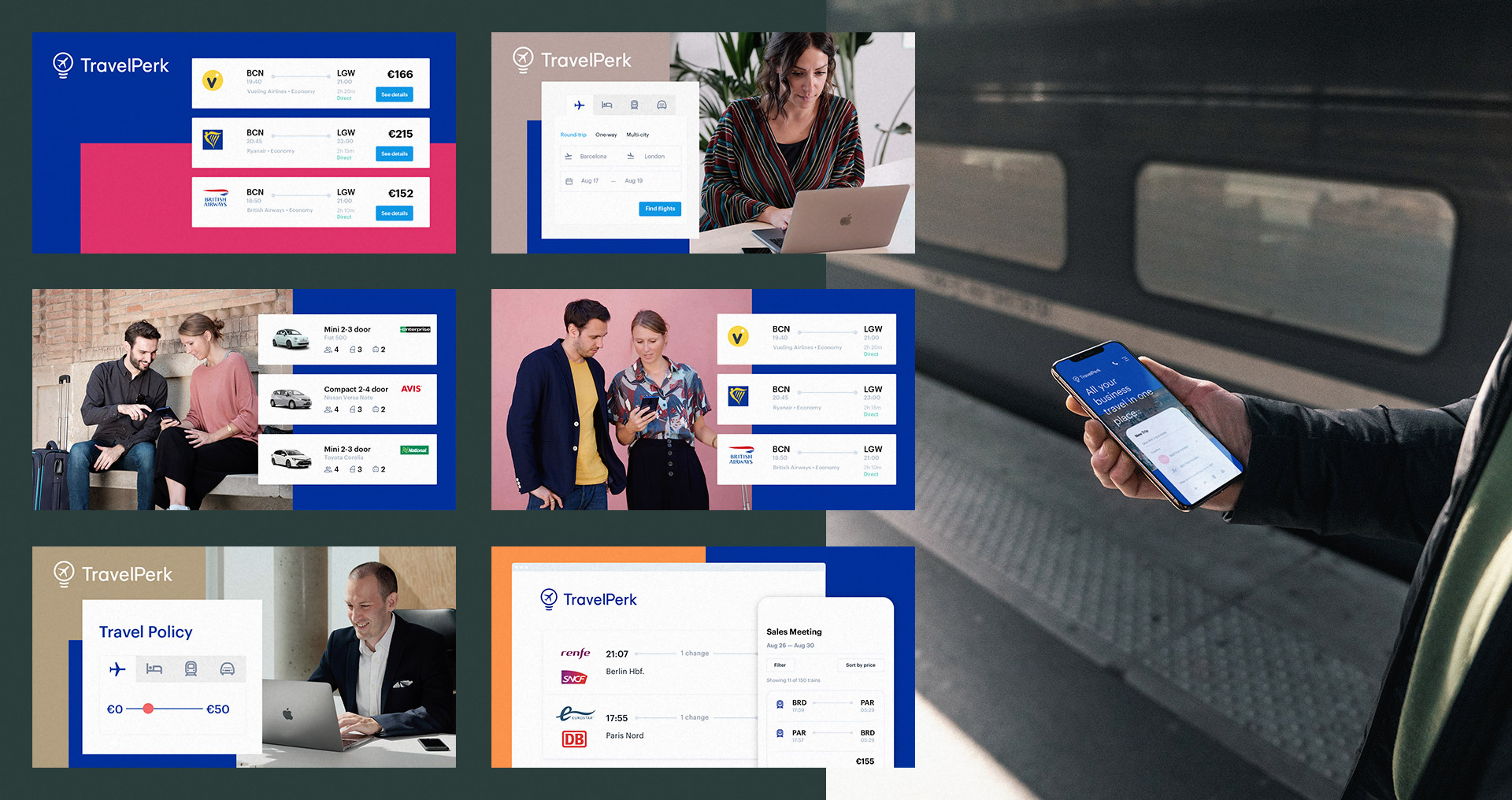
You may have noticed that some features have changed in the TravelPerk brand, a new font style, a new range of colours, a more human design, and new forms to communicate with the customers.
But the main commitment is that travelers come first and that will never change and always remain in the values of those who are part of this company.
The update of the new brand represents these fundamental beliefs and expresses the mission to lead the global transformation towards modern and sustainable travel.
How we did it? Simplifying things, exceeding expectations, helping make the best decisions when traveling, looking beyond how you plan, book, and think about traveling. We believe that travel has the power to change us and we can change the way we travel.
“Business Travel That Works” was the claim that unifies all expectations of the customers when they think about business travel.
Our journey started collaborating and helping to elevate the conception about TravelPerk, creating a consistent brand that represents his new values.
From the use of types to a wide range of colours, going through a new website, to what kind of photos we will use, was an incredible journey for a small team, that was completely stopped by some internal decisions based on Covid-19.
Here I will show some of the projects that I believed make the TravelPerk brand 1.5 better than ever.
Curious to see much more about this journey? Look at this post from David Hooker